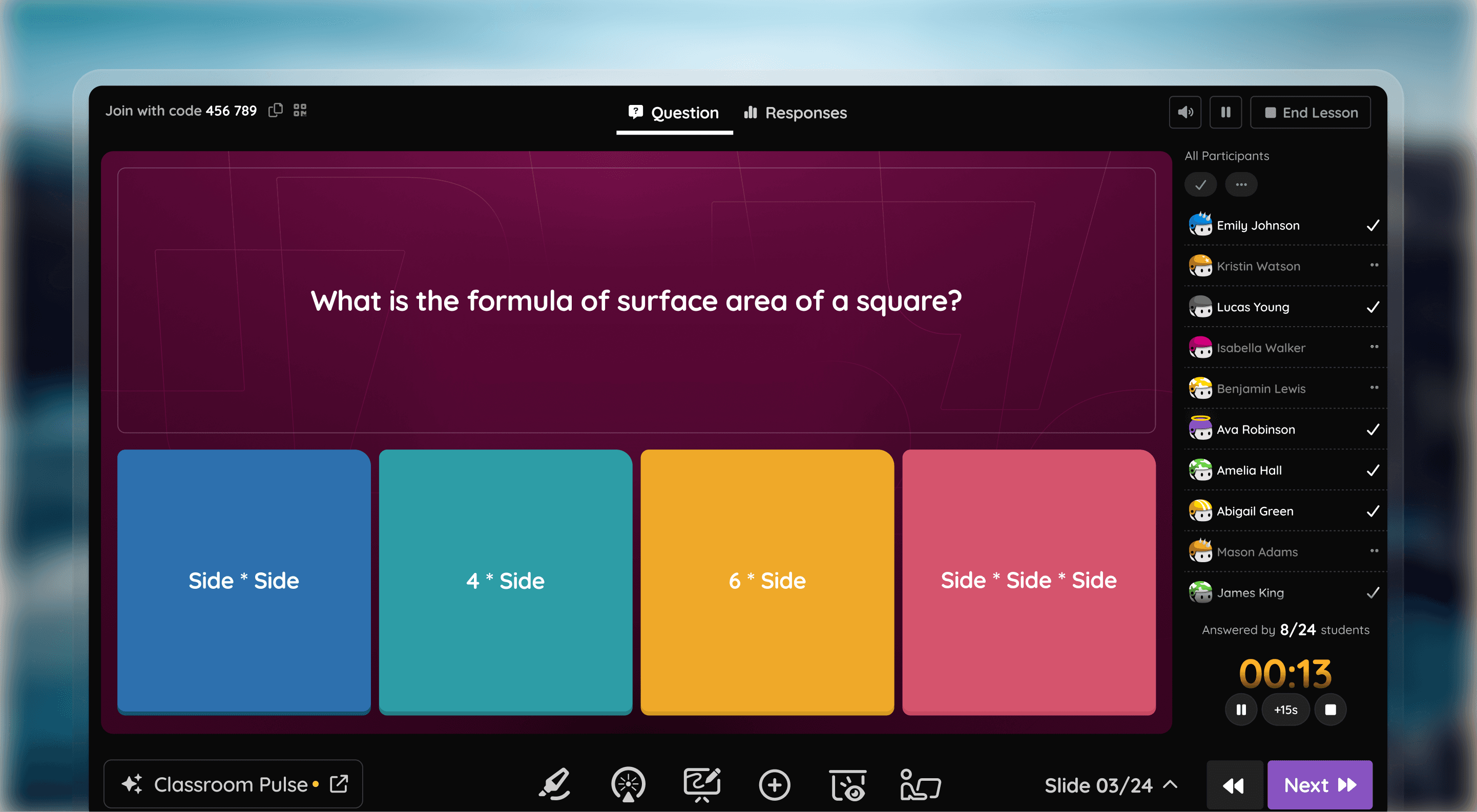
Wayground's Lessons Dashboard
Lessons occupy the largest chunk of classroom time, and without a strong lessons experience, Wayground (formerly Quizizz) was absent from the most important moments of teaching. Internally, this was reflected in the numbers: only ~6% of teachers used the Lessons Dashboard actively each month.
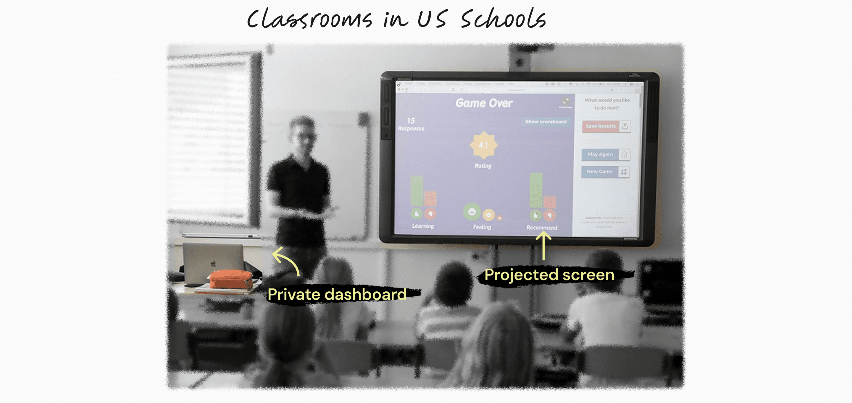
Along with a PM and a UXR, I led 45–50 in-depth teacher interviews, followed by classroom observations and school visits.
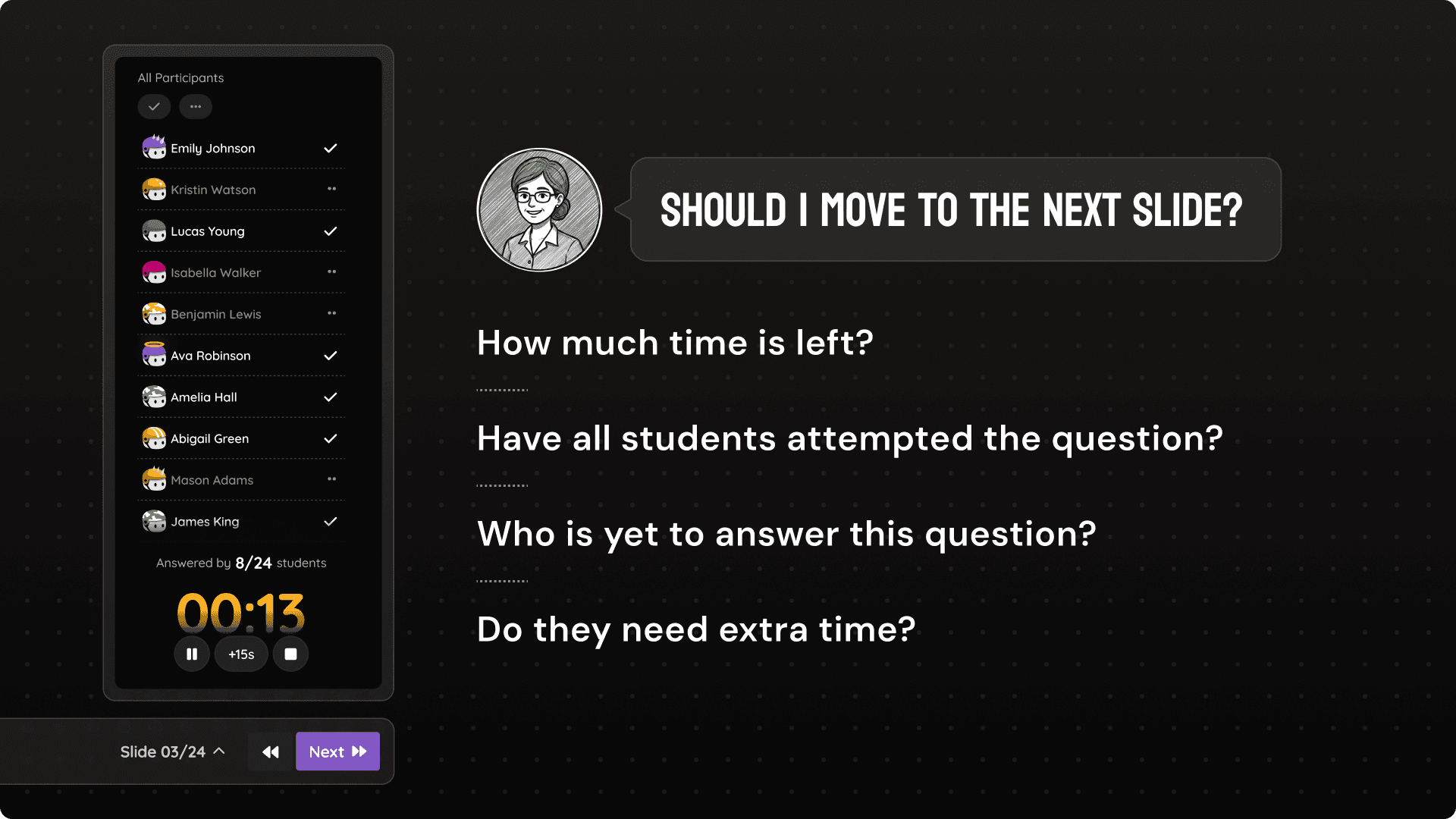
Across classrooms, patterns emerged. Teachers almost always worked with two screens—one public, one private. They avoided calling out students by name. They cared deeply about control, but not surveillance. And most importantly, they followed a consistent instructional rhythm.
A lesson dashboard is not a presentation tool.
It is a teacher’s private control room.
If lessons were going to matter, the dashboard needed to stop behaving like a content viewer and start behaving like a control surface for live instruction.
Instead of design principles, we went for a design framework this time!
To translate research into something actionable, I anchored the experience to a teaching model most US educators already use: I-Do → We-Do → You-Do.
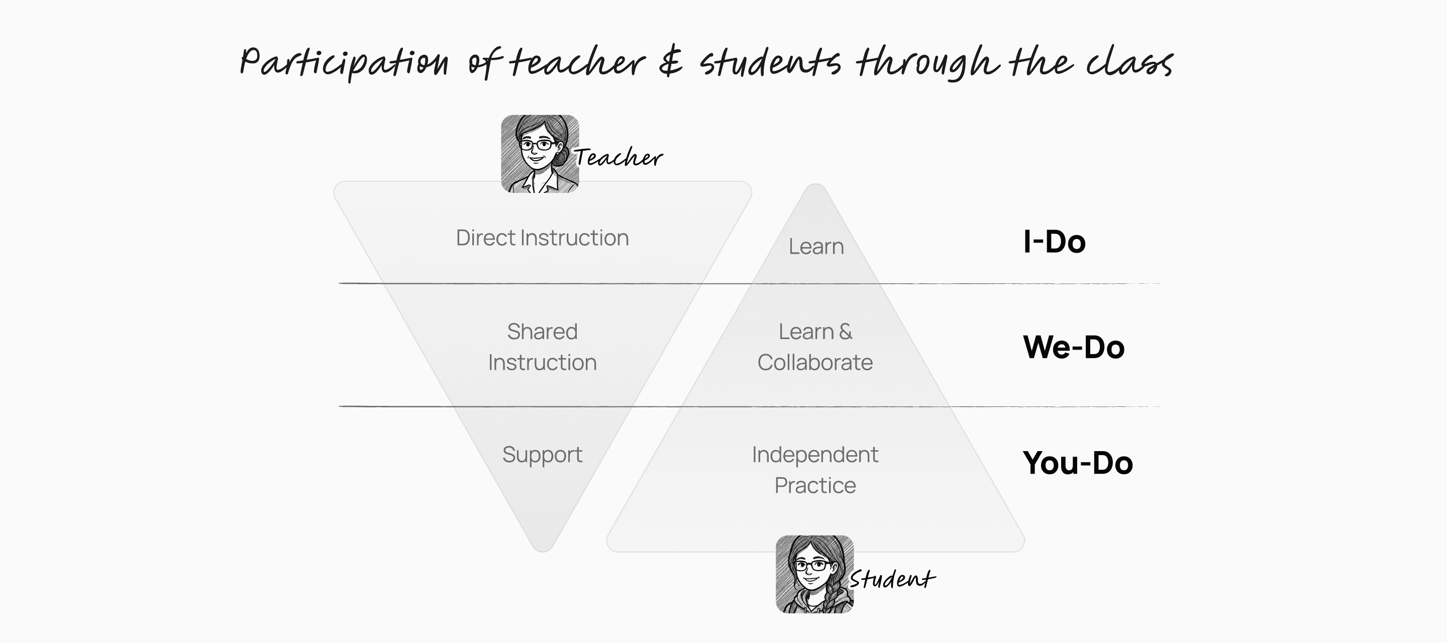
As the classroom progresses, the participation of a teacher moves from high to low while the participation of a student increases.
The Lessons dashboard stopped being a list of features and started behaving like a system that adapted to the moment of teaching.
We audited the current lessons dashboard
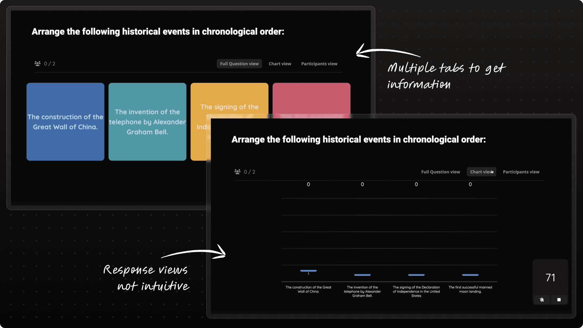
Apart from general hygiene changes, the navigation and Information architecture was something that didn't add up to the insights we got.
Whenever I come across a problem with such complexity and ambiguity, I put my 100% focus on figuring out the correct I.A.
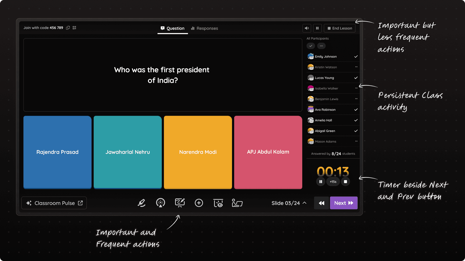
The new Information Architecture of Lessons Dashboard
To stress test this I.A. (Information Architecture), we validated it against real classroom use cases for teachers.
For eg: If a teacher wishes to move from 1 question to next, what are the possible data points they need to look at?
The side panel was designed to answer all of these questions in a glace!
"Meaningful engagement" as our north star metric ⭐
We pushed ourselves hard and decided to keep our north star metric as "meaningful engagement per monthly active teacher", which means we didn't just wanted teachers to use the new dashboard but also use it more meaningfully during their classroom sessions.
We decided to supercharge the dashboard with more meaningful features!
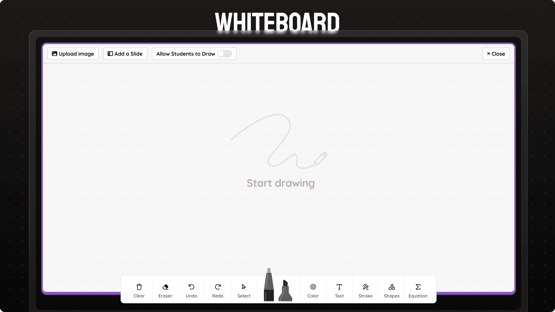
Teachers can use whiteboard to model questions and have open ended discussions to show step by step solutions. Teachers can also allow students to have their own whiteboard and check realtime progress.
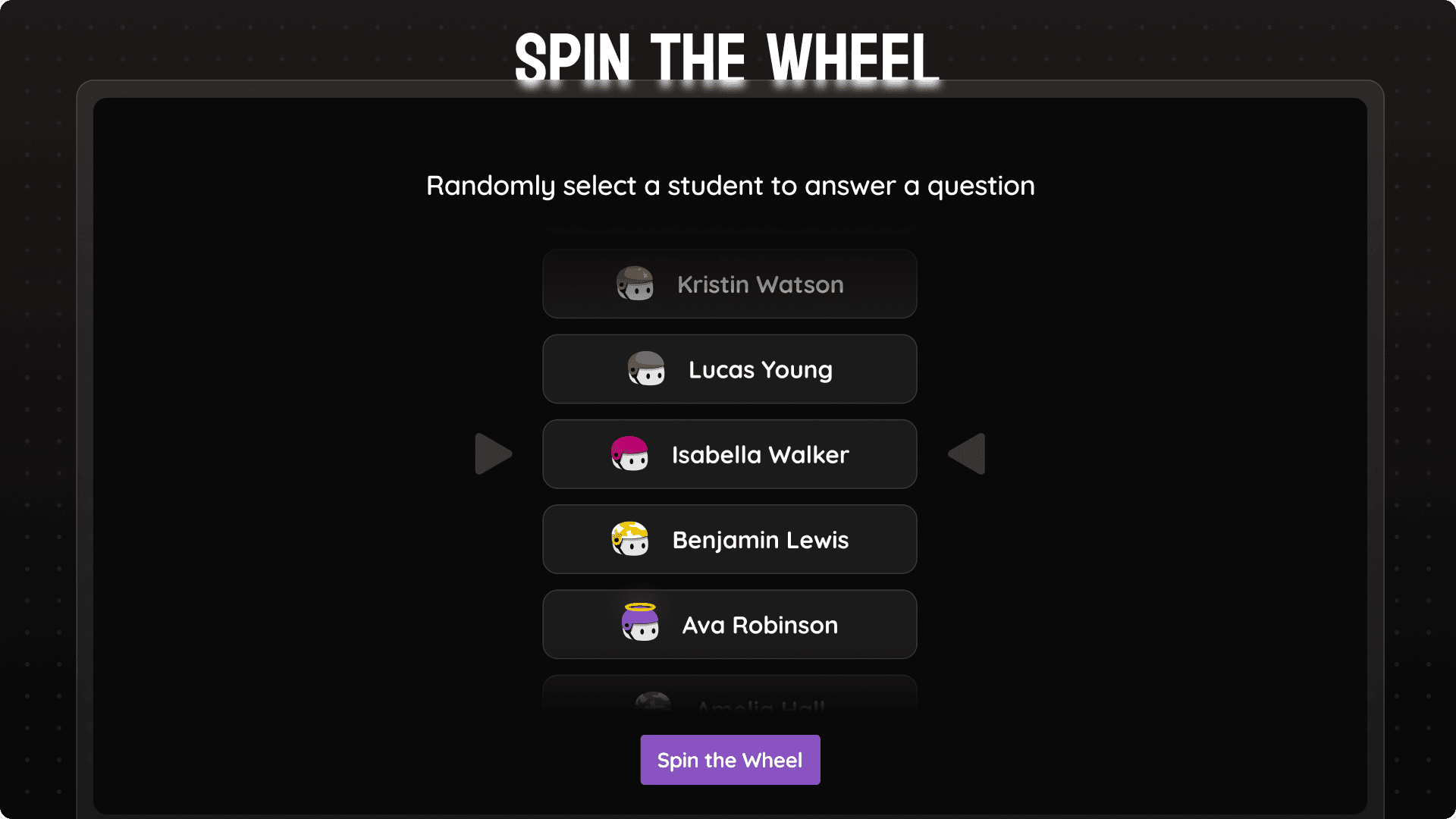
With anonymity as the key principle, spin the wheel allows teachers to select any student at random and ask them to do a task. Students love it!
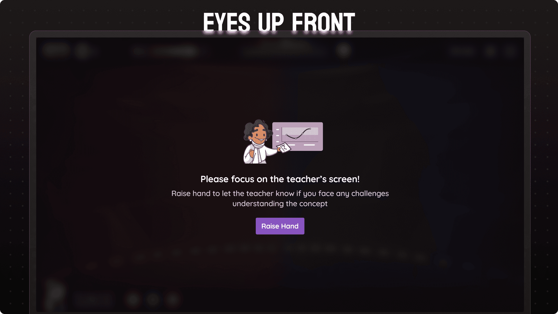
Most loved feature! Teachers can click a button and all student screens will show this message to gather attention back to the teacher. Specially useful to bring class back from chaos.
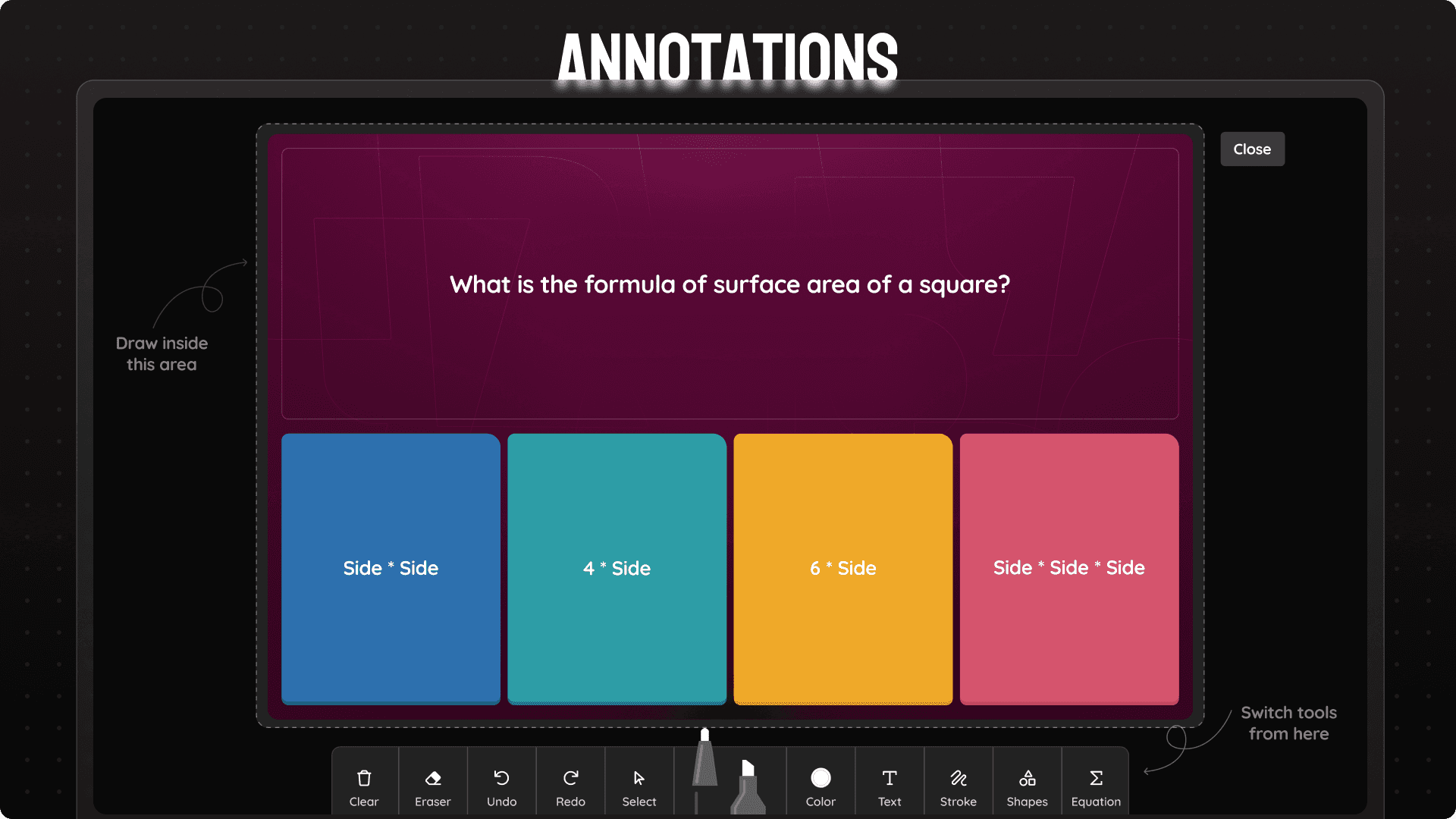
Want to mark important things on slides while teaching or need a moment to explain the question/instruction? Annotations open up a full toolkit that allows them to draw on current slide.
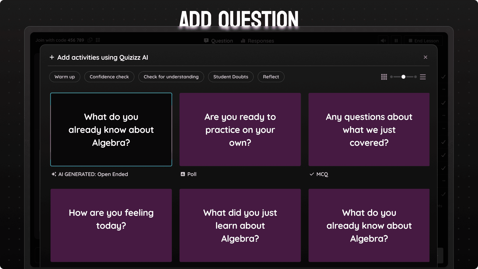
Just finished teaching a concept and need to check for understanding? Just select any question from our templates and get going!
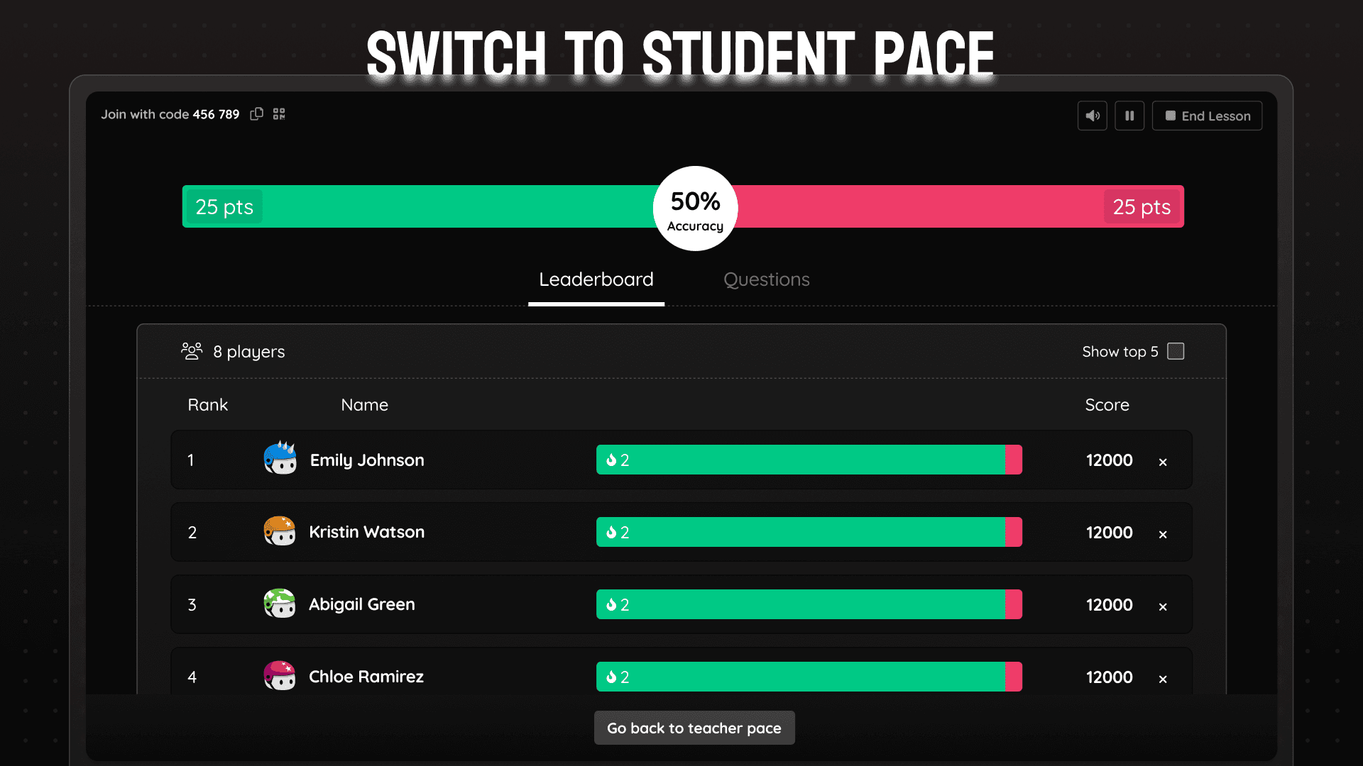
Teachers can move from a teacher paced session to student paced session anytime. They just have to select the start and end slide and all students can go through the selected slide range at their own pace. Specially useful for bell ringers and exit tickets.
This work happened under real constraints. The dashboard was built on legacy architecture, analytics only supported a subset of question types, and we had a fixed 1.5-month timeline to ship.
Instead of pushing for a full re-architecture, I made deliberate tradeoffs. We reduced step count between slides rather than reworking navigation entirely. We designed flexible response containers instead of building type-specific views. Visual refresh took a back seat to interaction clarity.
These choices allowed us to ship meaningfully without stalling execution.
🚀 The Launch Day!
We released the revamped dashboard to 10% of users, on schedule.
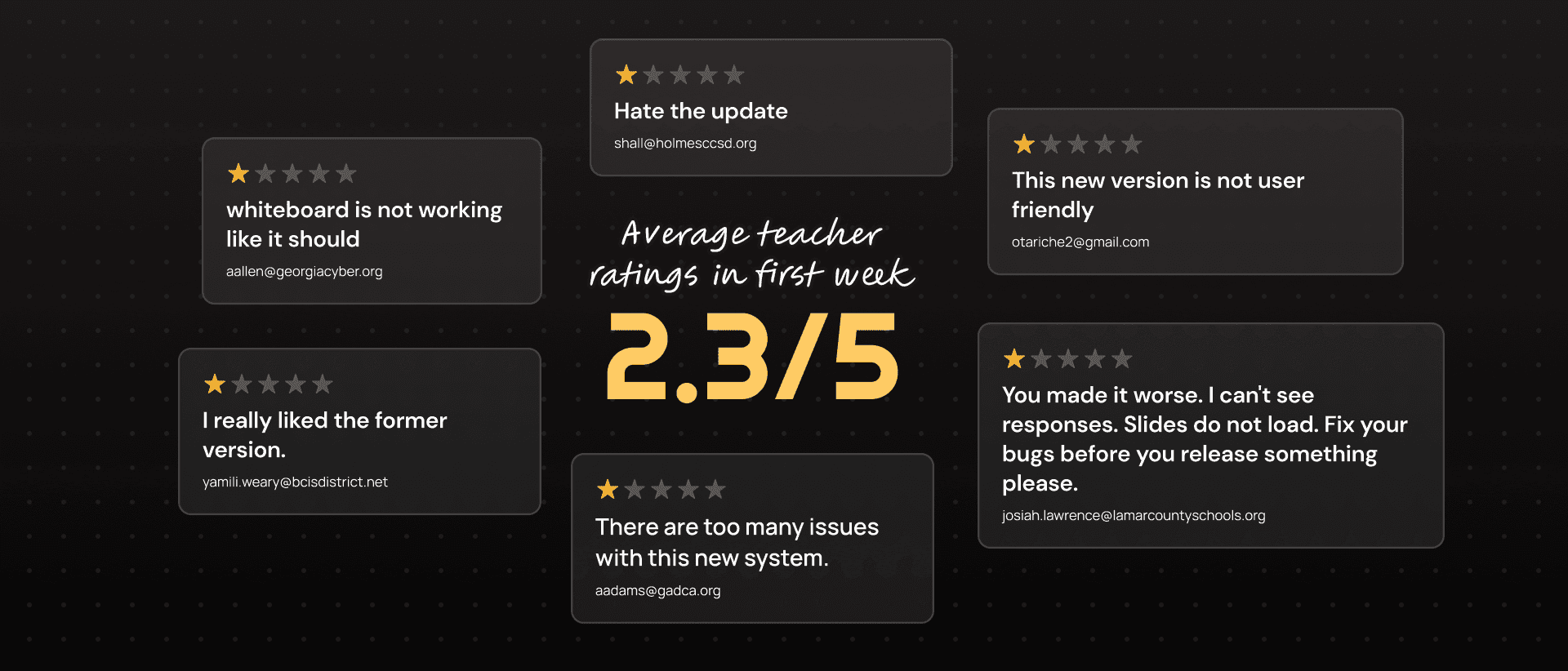
Almost immediately, support tickets spiked. Teachers were confused. Something wasn’t working.
When we added an in-product feedback prompt at the end of lessons, the average rating came back at 2.3 out of 5. It was the lowest point of the project.
The Comeback…
When we couldn’t afford another research cycle, I drove a zero-defensiveness feedback loop, reading raw teacher input daily, separating UX friction from bugs, and partnering with engineers to ship fixes fast, sometimes the same day.
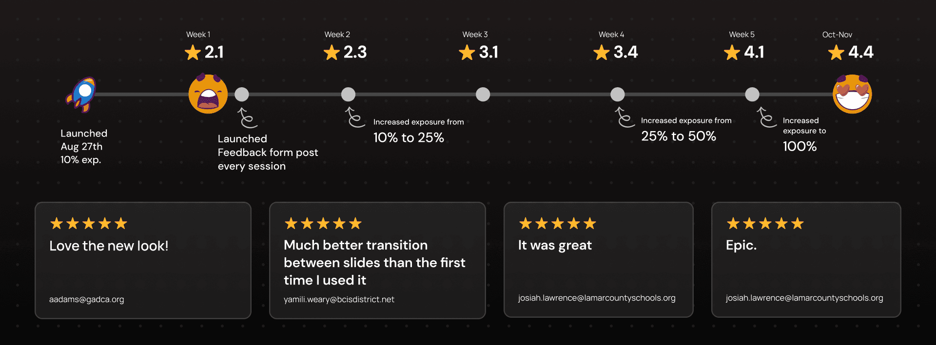
Within a month, teacher ratings improved from 2.3 to 4.4. Support volume stabilized. Teachers began explicitly calling out improved control and clarity during live teaching.
Outcome
6.3% to 11.56%
Share of Lesson in overall games per monthly active teachers
28%
Percent of monthly active teachers using new features
4.2 -4.6
Consistent teacher ratings post 100% release
To keep this case study focused, I’ve highlighted only the highest-impact decisions and outcomes. Many operational details, trade-offs, and learnings are intentionally left out. If you’d like to go deeper into any part of the work, I’d be happy to chat.